The problem
Porter is a platform for deploying and managing applications on your own cloud infrastructure. Customers ship on their own AWS, GCP, or Azure accounts with the experience of a PaaS, so they can manage infrastructure, deploy apps, and debug issues without wrestling with the messiness and complexity of native cloud consoles.
That last one (debugging) is unsurprisingly where our users need the most help. When something breaks, the question is rarely "what broke?" Instead, our users are more likely to ask, "what changed?", "which service is unhealthy?", and "what should I look at next?"
At Porter, we're lucky enough to have a stellar support team that helps users get to the root cause of their issues, around the clock. This, however, has its limitations: having to ask questions via Slack means that users are pulled out of the Porter dashboard, and therefore, out of context. This is a problem when the process of debugging is often about piecing together various details that form a picture of what could be going wrong, but all the details they'd need to actually debug their issue (deploy history, pod status, resource usage, logs) happen to live in the dashboard and not in Slack.
The solution
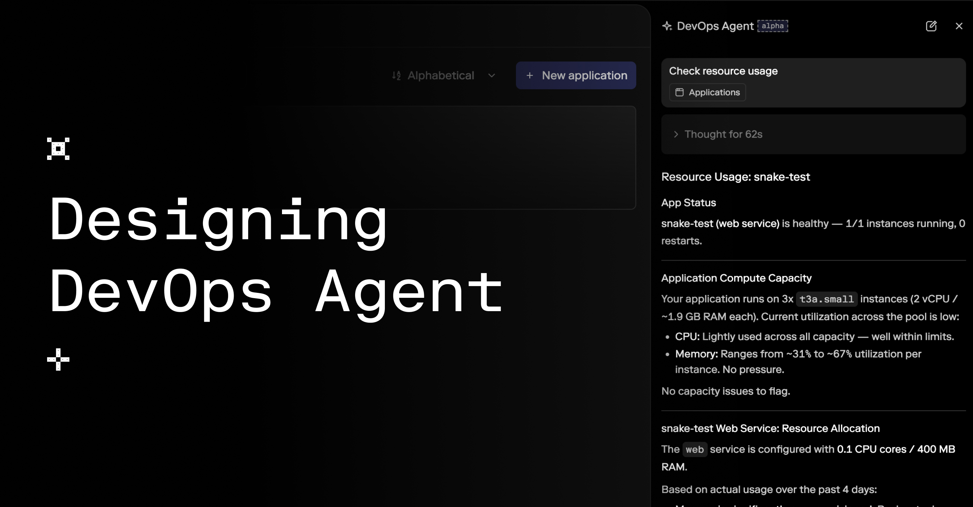
To help users get that picture as quickly as possible without leaving their dashboard, we released an early version of DevOps Agent in April.
A slightly contrived example of using DevOps Agent, shown at 1.25× speed.
DevOps Agent is an AI assistant that can inspect the same things a DevOps expert would check first. It pulls from context already in a user's dashboard, instead of making them reconstruct this information in Slack.
Why not just ask ChatGPT, you may ask? To put it simply, context. ChatGPT can help you reason through an infrastructure problem, but ultimately, it can't see what's actually happening in your cluster unless you were to copy over this information yourself. Inside Porter, we can provide that context through controlled tools without giving an AI chat assistant broad access to a user's cluster or secrets.
As I worked through the design and implementation of the interface, knowing we were only going to expose controlled tools was essential context. We were designing a new method to debug infrastructure, but this time, without asking users to do the legwork themselves.
Design questions
With that in mind, two questions bubbled up during the design phase: Where should the agent live? And how much of its work should it show the end user?
On where the agent ought to live: users are trying to ship, debug, or understand their infrastructure. This may seem obvious, but we know that users are not coming to Porter to chat with Claude. We weren't trying to expose the full product through an MCP, essentially making Porter something you interact with only through an AI agent. The answer sat somewhere between that extreme, and our current state, where users have no way to interact with Porter via a chatbot.
And on how much work it ought to show the end user: the answer users receive from the DevOps Agent had to be backed by clear evidence. Answers to issues pertaining to a user's infrastructure are only useful when users can see what the agent inspected. If a service is crashing, users need to see exactly what the agent checked before they trust its diagnosis.
The thinking state
That second consideration in particular led to way more iterations on the thinking state than I expected. We tried showing only the latest tool call, but that felt too sparse. We then tried showing all checks in parallel, but that was exposing too much, with the checks looking like separate events instead of one investigation. In extreme cases, the chat sidebar looked like a log viewer of sorts, which also meant that the final response from the agent (which is what users truly cared about) was pushed further down the already narrow scrollable window.
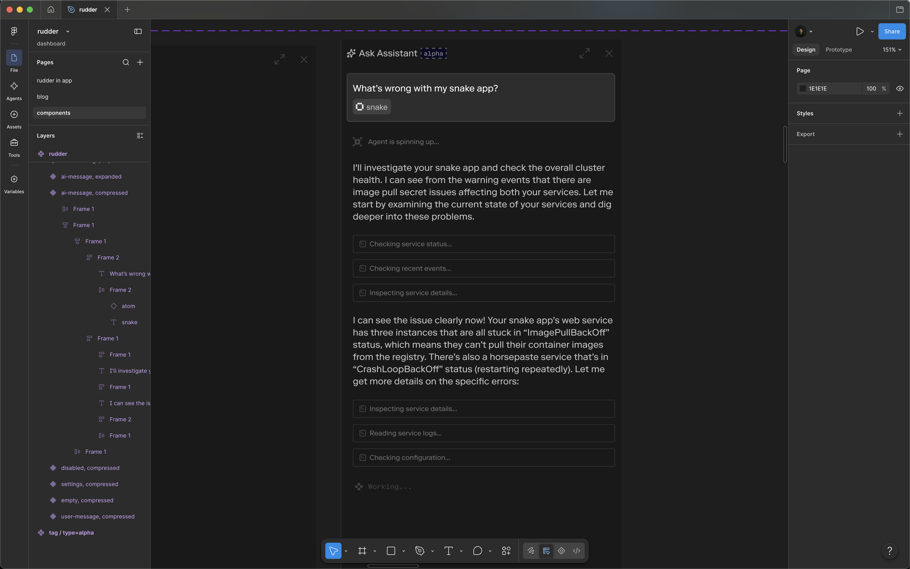
An earlier pass where each thinking step showed up as its own element in the chat sidebar.
Eventually, we landed on our current version. It cycles through calls, with a loader that flips to a check when each one finishes. Once the answer arrived, the thinking state collapsed into a panel automatically, with the full step list behind a click. It goes without saying that this is not a pattern we created: if anything, this is a common pattern across LLM interfaces. Still, we forced ourselves to evaluate whether it was worth implementing for our use case, and it was.
Tool calls cycle one at a time, then collapse once the answer is ready.
Funnily enough, the "collapse when done" animation takes more work than the interaction suggests. Since height: auto won't animate, we measure the streaming and collapsed heights, animate between them with the Web Animations API, then clear the inline styles. A little complex and over-the-top (and unfortunately requires the use of a useEffect...), but worth it.
const containerRef = useRef<HTMLDivElement>(null)
const lastStreamingHeight = useRef(0)
const previousDone = useRef(done)

// While the agent is still thinking, keep track of the live panel height.
useEffect(() => {
  const el = containerRef.current
  if (!el || done) return

  const observer = new ResizeObserver(([entry]) => {
    lastStreamingHeight.current =
      entry.borderBoxSize?.[0]?.blockSize ?? el.offsetHeight
  })

  observer.observe(el, { box: 'border-box' })
  return () => observer.disconnect()
}, [done])

// When thinking finishes, animate between two measured pixel heights.
// CSS cannot animate from height: auto.
useLayoutEffect(() => {
  const el = containerRef.current

  if (done && !previousDone.current && el) {
    const fromHeight = lastStreamingHeight.current
    const toHeight = el.offsetHeight

    // Freeze layout at the previous height.
    el.style.height = `${fromHeight}px`
    el.style.overflow = 'hidden'

    requestAnimationFrame(() => {
      const animation = el.animate(
        [{ height: `${fromHeight}px` }, { height: `${toHeight}px` }],
        {
          duration: 300,
          easing: 'cubic-bezier(0.23, 1, 0.32, 1)',
          fill: 'forwards'
        }
      )

      animation.onfinish = () => {
        // Let normal document flow take over.
        animation.cancel()
        el.style.height = ''
        el.style.overflow = ''
      }
    })
  }

  previousDone.current = done
}, [done])
Outcome
Ultimately, designing for a narrow agent let us make stronger interface decisions because we knew exactly what it was for. To help someone debug infrastructure without leaving the dashboard, we could choose which tools to surface to get users an answer they can trust with a clear record of what it looked at.
Made in Brooklyn, New York.
Last updated September 8, 2026.