The Dynamic Island is one of the more interesting interface ideas Apple has introduced in recent memory. The tl;dr here is Apple needed to work around the TrueDepth camera cutout on newer iPhones, so instead of treating it as dead space, they turned the cutout into an interactive surface.
Over the holidays, I wanted to better understand the design constraints involved with building something for the Dynamic Island. I started by quickly recreating Apple's existing patterns, then tried applying the same principles to live sports scores.
Recreating Apple's patterns
The Dynamic Island, in a nutshell, is the black pill surrounding the front camera on newer iPhones. It expands and contracts to surface live information (timers, calls, music playback) without requiring you to open an app.
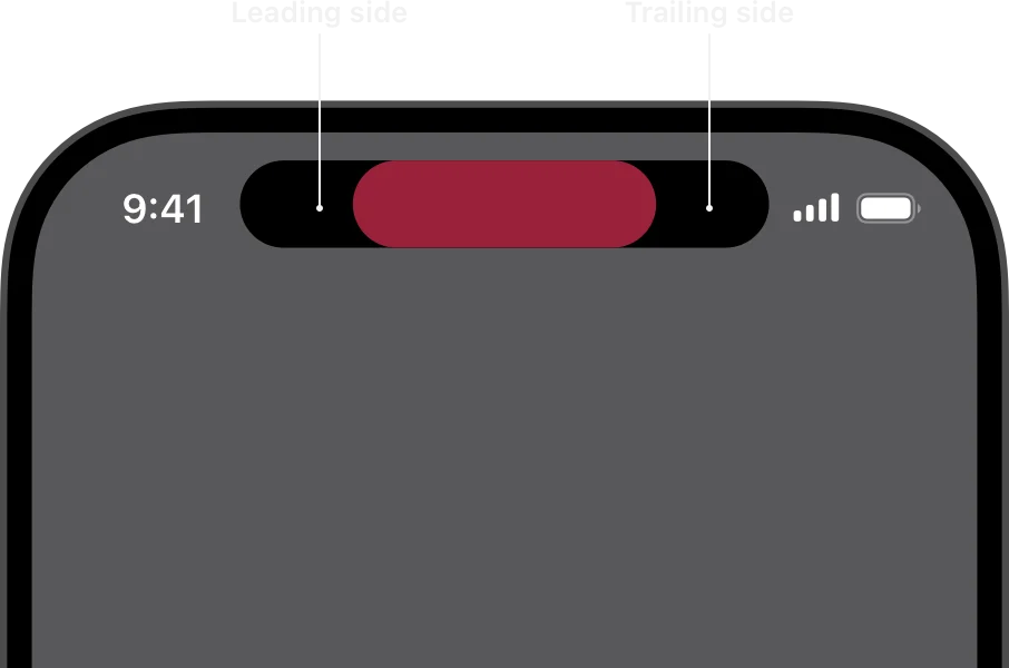
The leading and trailing content areas of the Dynamic Island, from Apple's Human Interface Guidelines
Functionally, you have about 52 × 37 points on each side of the camera in the compact view. Expanded, you get up to 160 points of height. The question that this brings up, then, is fairly straightforward: what information is truly essential at a glance, and what information is fine to be hidden behind a tap?
Toggle between states to see the idle pill, the ring/silent switch animation, and a countdown timer
Here's a quick re-creation of three native Apple behaviors: idle, ring, and timer. The idle state is the black pill. The ring mode shows the ringer toggle with a bell icon. The timer shows a circular progress indicator when compact, and shows more controls when expanded.
What's consistent with each of these variants amongst other native Apple Dynamic Island behaviors is that the "compact state" shows only critical information, whether it's the time remaining on your timer, or the status of your call. The expanded state, on the other hand, reveals more controls for users to interact with, and additional context that is judged to be not as valuable to the user as what is shown in the compact state.
Football: "who's winning?"
Of all sports out there, football may not have the most information. But there's still a lot to work with! What's the score, who's playing, how much time's left, what competition is the game a part of, were there any yellow or red cards… the list goes on. So then, at a glance, what truly matters?
Compact view shows team crests and score; tap to expand for match time and an event timeline
I figured the compact view must show what teams are playing (via their crests), and the current score. We skip how much time has passed, who scored, or what notable events have taken place within the game. This, for what it's worth, is what Apple currently does with the Apple Sports app as well.
The expanded view, on the other hand, is where I've diverged a bit from what the Apple Sports app does. I decided to add in the league/competition and a live timer at the top, the score with team names abbreviated, and a progress bar of sorts with event markers. Goals and cards are positioned on the timeline, with the progress bar compressing match state, events, and game shape into one element.
Cricket: what’s needed to win?
Cricket unquestionably involves even more information than football does, and therefore is a harder problem to solve. For the uninitiated; test cricket (the original and arguably most complex format) involves two innings per team, while games in any other format will also include wickets, runs, overs (as opposed to a "clock", and multiple active "players" on the batting side (aka batsman) and one active bowler.
Compact view shows the current score and target; expanded view adds more context
I chose a compact view that shows the batting team's logo and the current score in wickets-runs format (only because the example I picked was from this year's Ashes), and the chase target. You'll notice the bowling team doesn't appear at all. This is because in a chase scenario, only three things matter: the score, the target, and who's batting.
The expanded view gives us more information, but still relies on icons to convey information succinctly. A cricket bat next to a bastman's name indicates that they're on strike instead of spelling it out. The first innings' scores appear at reduced opacity and text size, with the goal here being to provide context without drawing the user's attention. What's required to win is shown in red for urgency. And as with the compact view, I chose to omit bowler stats, fielding positions, or a breakdown of extras. Narrowing our contnet to the batting team's chase makes it easier to fit what's essential.
The one question
The key takeaway here is that working with constrained space forces clarity. Working with the Dynamic Island seems to be, at its core, an exercise in information hierarchy and prioritization. You ask yourself, "What does the user need to know right now?" in the context of two views: with the compact view, you can maybe answer one question, with the expanded view, maybe three or four.
Made in Brooklyn, New York.
Last updated July 28, 2026.