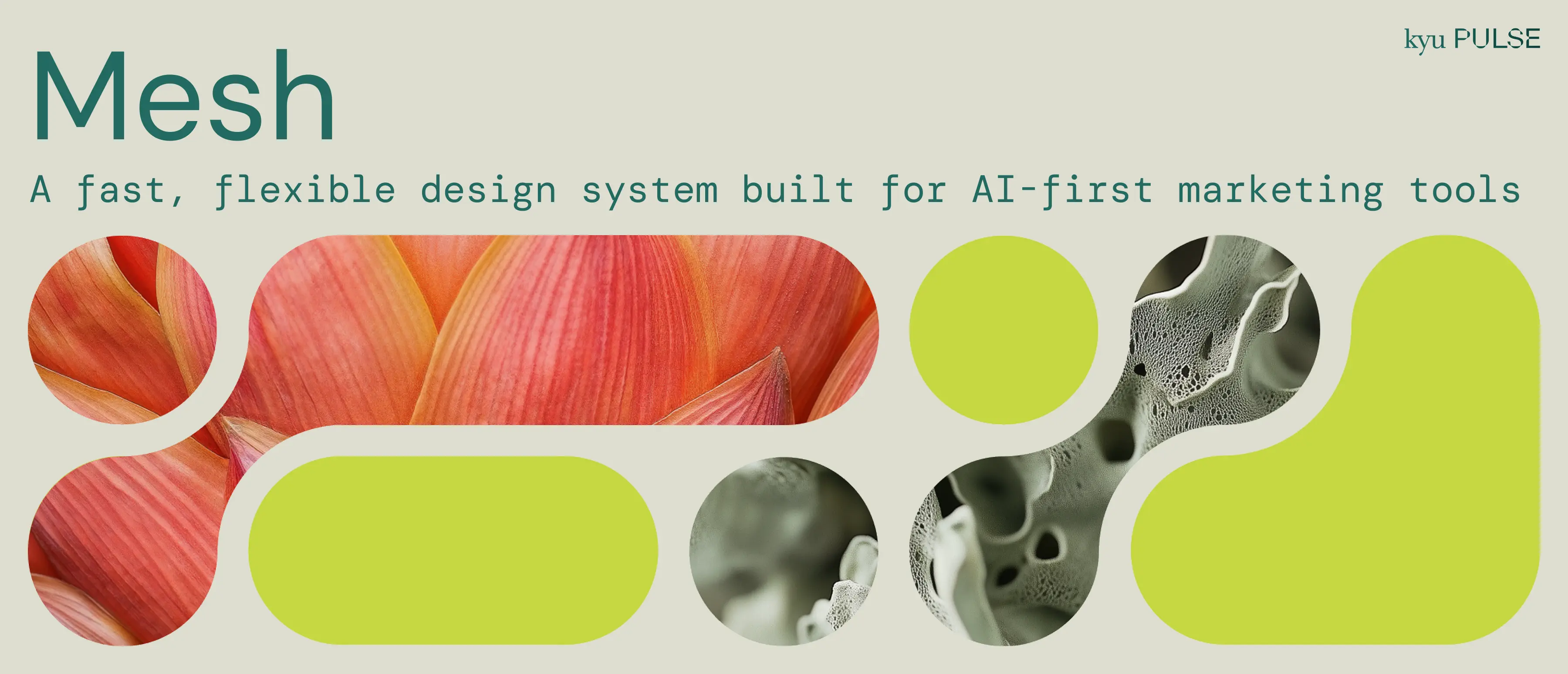
Mesh: A Design System Built for Speed
15 October 2025
- Project length: July - October 2025
- My role: Lead Design / Dev
- Skills: Design Systems, Visual Design, UX Design
- Tools: Figma, React, TypeScript, Storybook
Background
Mesh is a design system built for kyu Pulse, a unified network of creative and tech firms including Sid Lee, Kepler, BIMM, and Digital Kitchen. The network blends purpose-driven creativity with data and AI-enabled tech designed to deliver breakthrough client impact.
In mid-2025, we set out to build the Hub, kyu Pulse's first AI-powered marketing platform. The goal would be to provide tools to solve core marketing workflows; serving analysts, strategists, and executives across the network.
We needed to ship fast on a tight timeline. Every component needed to ship production-ready, while staying flexible enough to adapt as we identified which AI-first workflows would deliver the most value.
The Foundation
Thankfully, we weren't starting from zero. kyu Pulse had brand guidelines to work with –– a nature-inspired color palette, a type system using DM Sans and DM Mono, and a graphic language built on flowing metashapes and gridded circles. The visual concept centered on systems creating beauty through connection.
What we needed was a design system to translate that brand into interactive components. That's where Mesh was born.


The thought behind naming our design system "Mesh" centered on independent elements forming a stronger whole through connection, reflecting how kyu Pulse brings together distinct firms into a unified network. It connects visually to the metashapes that flow and combine, while echoing the grid system that provides structure underneath.
Ultimately, Mesh embodies the brand's central philosophy: systems creating beauty through connection. Each component is a node. Together, they form something more capable than any single element.
Strategic Technical Choices
While we'd avoided Tailwind for past Kepler-specific projects in favor of CSS Modules (particularly given we were working with Mantine components, more on that here), for Mesh, we decided to make an exception. shadcn/ui with Tailwind became our foundation.
The reason was ultimately pragmatic. LLMs are exceptionally good with Tailwind, and we wanted to lean into using AI for boilerplate code rather than fight it. Built on Radix UI primitives, shadcn/ui gave us accessible components we could own completely.
While there are potential downsides to this given the recent risk of Radix being maybe left a little more unmaintained than most people would like, the shadcn/ui approach allows us to replace the underlying primitive from other options, and ultimately, Radix remains a fairly battle-tested library.
In terms of styling and themes, semantic color tokens solved future theming needs before they became problems. Components reference primary and accent instead of hardcoded values like lake-600. When we need sub-brand themes for individual network companies, we swap color schemes without touching component code.
/* Theme Colors */
--lake-600: #51a090;
--carrot-600: #f74564;
--lichen-600: #bedb46;

/* Semantic Tokens */
--primary: var(--lake-600);
--accent: var(--lichen-600);
--destructive: var(--carrot-800);
Components never reference lake-600 directly. They use semantic tokens:
<Button className="bg-primary hover:bg-primary-hover text-primary-foreground">
  Submit
</Button>
This indirection means theming for a kyu Pulse company like BIMM requires changing a single line, swapping lake-x for BIMM's orange in the semantic token assignment, and not hunting through component code.
Components
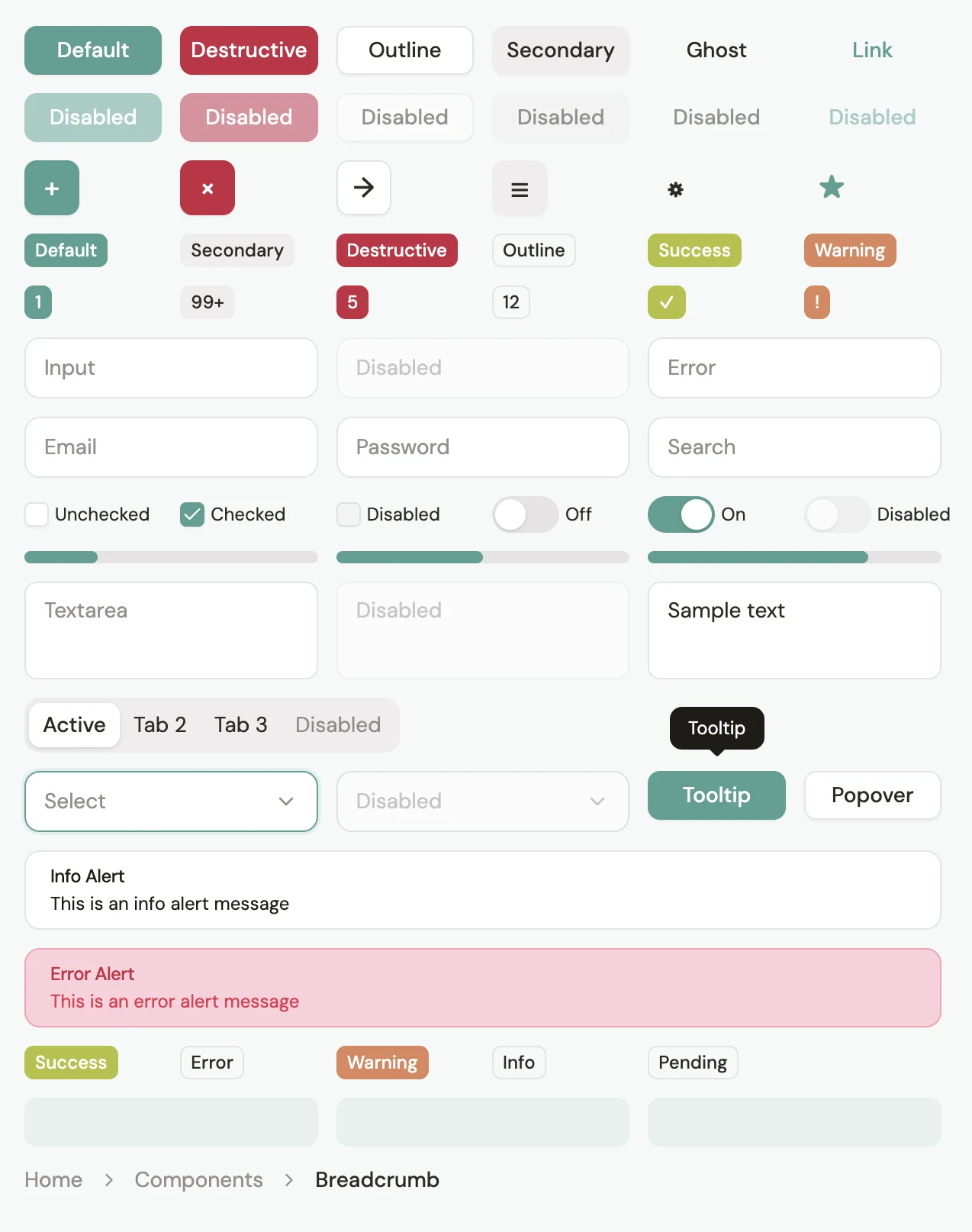
Mesh includes the full range of interface building blocks: buttons, inputs, cards, badges, selects, checkboxes, tooltips, popovers, and dialogs. Most inherit directly from shadcn/ui with minimal customization (just enough to apply our semantic tokens and animation constants!)
Two components deserve special attention.
The artifact card displays task outputs with distinct states. The "working" state uses a subtle pulsing animation on the gradient background, giving visual feedback without being distracting.
And the chat interface, obviously a key part to any LLM-based application, handles message threading with staggered entrance animations, helping make conversations feel naturally paced rather than instantaneous.
Motion as Brand Expression
For motion, we set up deliberate constraints to work with. We built shared constants with three durations (instant, fast, normal) and two easing curves (in-out, out) with all of our framer-motion based animations. Every animation references these values, creating a consistent motion language.
Documentation
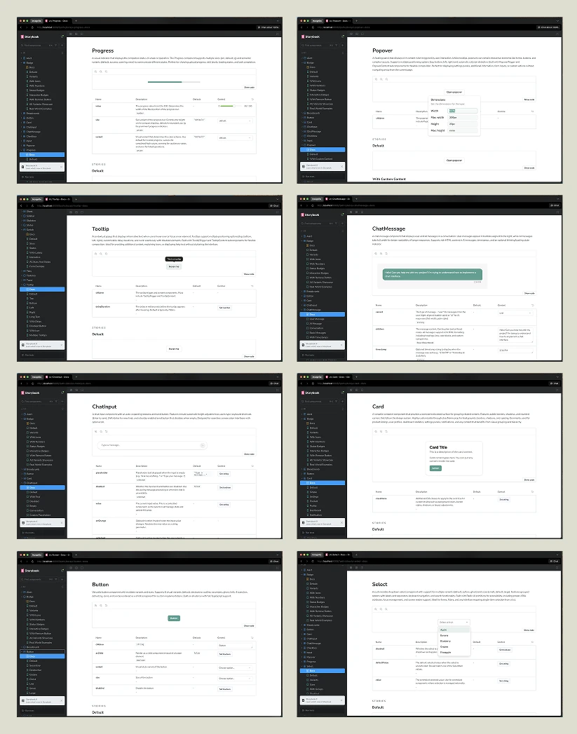
As with any good design system, Storybook serves as Mesh's single source of truth. Every component has a dedicated page with interactive examples, prop controls, and code snippets. Engineers can test variants, toggle states, and see exactly how components behave before integrating them.
Storybook also doubles as our component editor. With AI assistance, even non-technical team members can style and refine components directly in the browser. Design and development happen in the same place.
Documentation isn't separate from the code either; it lives alongside it. When components update, Storybook updates. No drift between docs and implementation.
Conclusion
Mesh has, so far, delivered on its goal: ship fast without creating debt. Components have stayed consistent. Motion and animations feel intentional. And when we need to scale to new sub-brands or add new features, the foundation is already there.